Princeton University featured in the Architectural Record Colleges & Universities issue: Economies of Scale

Article content
Click here to view Architectural Record
It’s a challenge that many universities face: What to do with lovely, old buildings on campus that have become run-down and outdated? Some schools add jarring additions or try to create a faux period piece with a renovation, while others tear them down and erect bold contemporary structures in their place.
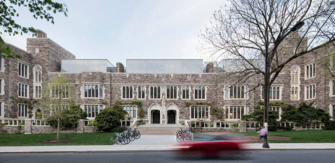
At Princeton University, a campus with a tapestry of collegiate Gothic buildings, as well as major midcentury and contemporary icons, KPMB Architects skirted all these choices and came up with a stunning solution. The Toronto-based firm reinvented the 1929 Frick Chemistry Laboratories, designed by Charles Klauder, by perfectly straddling a line between preserving what made the building special and creating a new core that has everything a student or faculty member could want. Landscape designer Michael Van Valkenburgh’s careful deletions and additions around the building are also critical to the magic, as is his restoration of Beatrix Farrand’s original landscaping. According to university architect Ronald McCoy, the former Frick’s transformation into the conjoined Julis Romo Rabinowitz Building and Louis A. Simpson International Building is the most significant renovation of any Princeton historic building.
The structure, which faces busy Washington Road, now houses Princeton’s economics department, which was scattered around campus, as well as the university’s international programs (the consolidation was the final piece of the puzzle in Princeton’s last master plan from 2006). It also provides a porous boundary between the historic western campus and its contemporary northeastern corner.
KPMB’s strategy for the 200,000-square-foot building was less about precious restoration than celebrating its quirky features while drenching the interior with daylight and lavishing it with careful detailing and a variety of luxurious spaces to work, learn, and hang out. The firm retained the cast-in-place concrete structure with its masonry walls, purple-gray argillite facade, and limestone quoins and arches, but gutted the interior, which had felt like a basement. “Now it has gravitas, but also light and flow and buzz,” says Shirley Blumberg, KPMB’s partner in charge.
Most dramatically, KPMB added two light-filled, anchoring atriums, one just inside the western entrance off Washington Road, serving the economics department, and one to the south—where the Frick’s original H-shaped footprint was given a rectangular addition in 1964—for the international departments. After stepping through the carefully preserved original lobby, with its iron gates by master metalsmith Samuel Yellin (1884–1940), visitors emerge into the first soaring atrium. Dubbed the forum, it is a hushed space, with inviting lounge furniture, underneath a suspended glass-walled seminar room. Offices, classrooms, and more seminar rooms are grouped around the perimeters of the upper three stories, with corridors that overlook the central space.
The architects made a showcase of the dividing line between the 1929 building and the 1964 addition, creating a glass vitrine that brings daylight streaming as far down as the basement levels from new skylights. Glass-walled seminar rooms on the fourth floor have views of the campus and peek up above the building’s original roofline. A quirky, complicated building—that rises one floor higher toward the east—is now cohesive and easy to navigate.
As with the entrance lobby, KPMB preserved the building’s former library, a rich, wood-paneled room, retaining the white oak floors but adding a fireplace and a hidden kitchen. “We saw the microcosm of the whole campus in this building,” says Bruce Kuwabara, KPMB design partner. “It moves from Gothic to more modern.” The south atrium, for example, incorporates walls that were once on the Frick exterior, complete with their arched limestone windows. A small café here has a porcelain-tile floor that matches the bluestone seen around campus. Nearby, the architects removed an unsightly narrow addition from the east elevation to create an inviting new entry off the back of the building, facing Minoru Yamasaki’s iconic Woodrow Wilson school and the Scudder Plaza.
KPMB and Van Valkenburgh have brought a new sense of openness to that plaza, with its sunken, rectangular reflecting pool, which Yamasaki designed in tandem with his slender-columned building. Its neighbors include Stephen Voorhees’s 1951 redbrick Corwin Hall, and Fisher and Bendheim halls, designed by Venturi, Scott Brown and Associates in the 1990s. “At a campus like Princeton’s, where the strategy is connectivity, this bit of Modernism was isolated and inwardlooking and very selfish,” says McCoy. That impenetrability is now gone, thanks to the removal of some of Yamasaki’s plaza walls and KPMB’s new entrances in the former Frick.
Besides the plaza, “Princeton is full of courtyards and quadrangles,” says Kuwabara. “But our atriums are the equivalent.” Given the amount of working, chatting, and even napping in these well-appointed spaces, the students have clearly embraced them. “There’s a word-of-mouth effect among students when a great new space opens up,” says McCoy. “I think it was a surprise to the economists that it would be such an attractor; they are adjusting to the fact that they are on the map of nice places.”
Related News
Year in review: The highlights of 2024
December 20, 2024
)
)
)