In the suburbs, sober or sculptural? Etobicoke Civic Centre Competition discussed in The Globe and Mail

Article content
Click here to view The Globe and Mail
A city hall design competition. It’s a powerful phrase in Toronto, which transformed itself in 1958 with a global contest and Viljo Revell’s twin towers.
Now, the city is doing it again, for a new Etobicoke Civic Centre. On Tuesday evening, four teams of architects and landscape architects presented their ideas for the complex, which will sit on a reclaimed site at Bloor and Kipling.
And that site is tricky: It is, like most of the City of Toronto, car-oriented suburbia. In fact, it’s basically a highway interchange, a “spaghetti junction” of ramps and intersections. So how do you introduce Jane Jacobs-ian values to create a walkable, mixed-use, pedestrian-oriented place? How do you make a place where citizens will want to gather, even if they drive there?
The task is huge, and the proposals presented this week – each of them strong architecture with an eye on sustainability – suggest how that might happen here and in other similar places across the region.
A winner was being selected by a jury this week, and the plan will go to Toronto City Council for approval this fall.
The move makes sense. Twenty years after Metro Toronto’s municipalities were amalgamated into one, the current Etobicoke Civic Centre needs many repairs. Rather than fix up that 1960 complex, the city aims to sell it; the new, relocated centre will be a local civic centre with city offices, a chamber for the local community council, a rec centre, a library, a daycare and a square.
It would sit on a 13.8-acre site, once a drive-in theatre, that’s stuck in the middle of all those roads. Meanwhile a $45-million road reconstruction will bring ordinary streets and blocks. The vision is for a new neighbourhood.
But now, it’s nothing. And how do you build on that?
One approach: You build in many small pieces. The team led by the Danish architects Henning Larsen and Toronto’s Adamson Associates imagined the site as a sort of quilt; a series of small blocks house the council chamber, pool, library and gym, while a set of towers would step up from short to mid-rise. A straightforward public square sits to the south and east, sheltered from the prevailing winds – while the building shelters it like a cluster of villages.
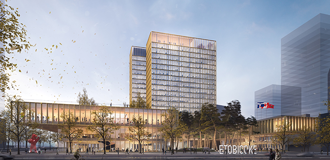
A second approach: You build a porch. Two proposals followed this logic, blending an office tower with U-shaped lower buildings that frame a square. Toronto’s Diamond Schmitt with the U.S. landscape architects Michael Van Valkenburgh Associates made their square a green mound, a “natural amphitheatre.” Toronto’s KPMB and West 8 – the Dutch landscape architects who led the Queens Quay redesign on Toronto’s waterfront – draw a hard square with a canopy of tall jack pines and a water feature: Imagine mist wafting between the trees on a summer day.
Both focused on making their office towers exceptionally energy-efficient, with lessons that can translate elsewhere. (No. 1: Don’t make it all glass.) KPMB lined the facades with bronze mullions and much of the public interiors with timber, delivering what for me is the most convincing architectural expression. Diamond Schmitt, on the other hand, engaged more carefully with Bloor Street, creating a large and clearly legible retail space with a canopy. If this wide, fast part of Bloor becomes more of a walkable strip, that design will serve well.
But that’ll take a while. And the fourth entry says, in essence: Forget your sober, square, street-facing structures; let’s build something memorable. Designed by Toronto firms MJMA and Moriyama & Teshima in collaboration with Forrec, this scheme imagines a taller tower, with champagne-coloured aluminum skin and a south facade that slants downward like a cliff face. It’s shaped to minimize shadow. At street level, the project goes crazier: The ground lifts up to cover the public spaces with a green roof. You can walk on it, run on it and then go skating in a new park that the architects have pulled from across the street in the new plan. This complex, multilayered set of spaces would largely ignore busy Bloor Street, but it would be a fascinating and pleasant place to hang out. It’s a bold vision.
That’s good, because the city’s process is not as bold as it should have been. The finalists were selected based on their CVs, and then asked to submit designs. In an open competition, entrants would have submitted ideas anonymously. That gives a leg up to smart young architects with good ideas – who are never otherwise going to convince an institution to let them shape hundreds of millions of dollars in building. That’s how you got the quirky genius of Toronto City Hall, and that’s what public bodies should be doing, for the good of the city and the culture.
Meanwhile, if the competition jury decided to go with bold rather than careful, they have the option here: to build an icon for a new Toronto and the suburb of the future.
Related News
KPMB remembers Robert G. Hill
March 2, 2026Marianne McKenna to deliver keynote at Taking Stock
February 26, 2026KPMB to host BAIDA’s first Externship program
February 18, 2026
)
)
)